 Christmas Mega Sale – Enjoy Up to 50% OFF on Every Plan!
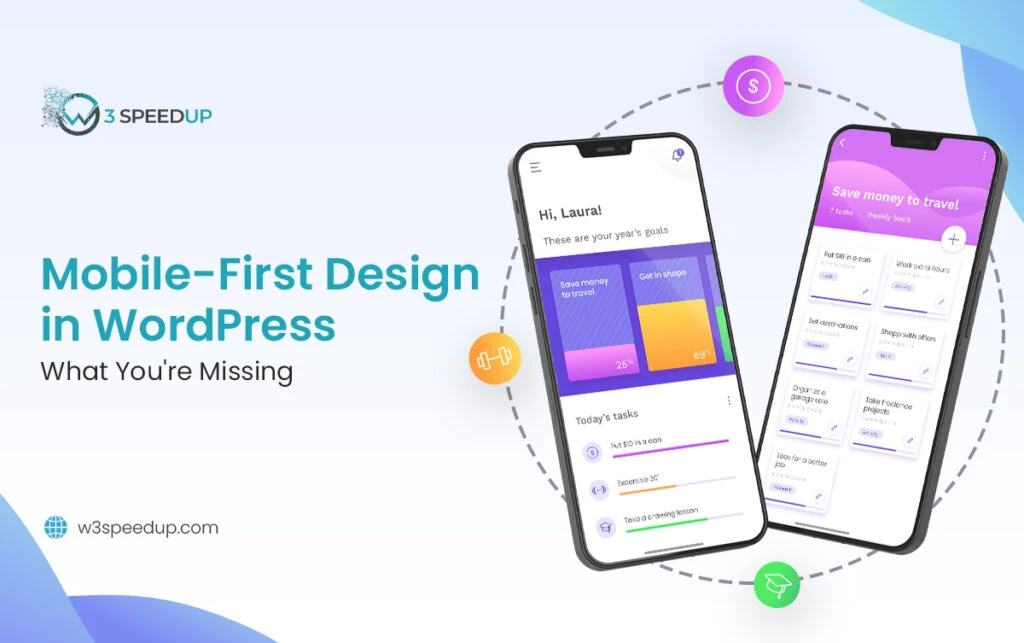
Mobile-first design is no longer a trend—it’s the standard. Over 60% of global web traffic comes from mobile devices, and if your WordPress site doesn’t prioritize mobile users, you’re leaving traffic, conversions, and user satisfaction on the table.
While many WordPress themes claim to be responsive, truly designing for mobile-first requires more than shrinking content to fit smaller screens. It means rethinking structure, performance, and user experience from the ground up.
Here’s what most developers and site owners overlook when building mobile-first WordPress sites—and how to fix it.
Prioritizing Content Hierarchy for Small Screens
A common mistake is designing for desktop first and then rearranging elements to “fit” mobile. But that often leads to cluttered, confusing layouts on phones.
What You Might Be Missing:
- Mobile users scroll with intent—put key information and CTAs first
- Headlines, value propositions, and buttons should be visible above the fold
- Navigation should be collapsible and intuitive
Start with mobile wireframes before adding complexity for larger screens. This ensures your site’s structure is designed around the user’s actual behavior.
“Mobile-first isn’t just a layout philosophy—it’s a user behavior mindset,” says Samantha Steele, Director of Financial Strategy at GrowthNavigate who’s optimized over 200 WordPress sites for mobile. “Design decisions should start with the smallest screen and the most impatient user in mind. If you can nail that experience, everything else falls into place.”
Choosing the Right WordPress Theme (and Not Just Any Responsive One)
Not all “responsive” WordPress themes are optimized for mobile-first performance. Some are bloated with scripts, sliders, and animations that drag down mobile speed.
What to Look For:
- Lightweight, performance-optimized themes like GeneratePress or Astra
- Minimal use of large background images or auto-playing media
- Native support for mobile breakpoints and flexible typography
Always test your theme on real devices—not just emulators. Responsiveness isn’t the same as usability.
Just as building a high-performance product can dramatically change your business trajectory—think of Ring’s founder and inventor Jamie Siminoff, whose creation not only revolutionized home security but skyrocketed his brand’s visibility and success (with Jamie Siminoff net worth now estimated in the hundreds of millions)—your WordPress theme should be built with scalability and speed in mind. The right foundation creates momentum that pays off long-term.
Managing Mobile Load Speed
Mobile users have less patience. Even a two-second delay can significantly increase bounce rates. WordPress sites, especially those with plugins and media-heavy content, are vulnerable to poor mobile performance.
Where You Might Be Losing Speed:
- Unoptimized images and video
- Too many third-party scripts (social embeds, tracking pixels)
- Slow-loading fonts and sliders
Solutions:
- Use image compression tools like ShortPixel or TinyPNG
- Defer offscreen scripts and eliminate render-blocking resources
- Choose fast, mobile-friendly hosting and implement a CDN
Google’s PageSpeed Insights and Lighthouse tools can reveal exactly where your mobile site is lagging. Just like converting fraction to percent for better clarity in analytics, simplifying performance data into mobile-specific insights makes it easier to identify and prioritize critical fixes.
You should also consider URL shortening tools when linking to external resources or CTAs within your mobile content. Shortened URLs improve aesthetics, reduce load times associated with long tracking parameters, and enhance user trust—especially when used in mobile popups, buttons, or SMS marketing flows.
Case studies in digital entrepreneurship—like the rise of creators-turned-founders—can be just as enlightening. Take Kyle Forgeard, co-founder of NELK and Full Send, whose massive social media success and smart brand monetization strategies have led to major business growth (with Kyle Forgeard net worth frequently making headlines). In the same way Forgeard scaled with speed and precision, your mobile-first site should load quickly, function smoothly, and deliver value instantly to meet today’s user expectations.
Ignoring Touch Optimization
A desktop site uses clicks. A mobile site needs to be built around taps, swipes, and thumb-friendly design.
What You Might Overlook:
- Buttons that are too small or too close together
- Dropdown menus that are hard to open
- Tap targets not spaced far enough apart
Stick to a minimum target size of 48px for interactive elements and ensure users can navigate easily with one hand.
Overcomplicating the User Journey
Mobile users are goal-oriented. They’re looking for quick answers, easy navigation, and immediate actions. Cluttered pages or hidden CTAs kill conversion.
Simplify by:
- Removing unnecessary popups and distractions
- Streamlining forms—ask for only what’s essential
- Using sticky headers or fixed-position buttons for key actions
- Implementing a unified communication platform to centralize chat, support, and contact features so mobile users can engage without jumping between channels
If a user can’t find what they need within a few seconds, they’re likely to leave.
Overlooking Mobile SEO Factors
Google indexes mobile-first. That means your mobile site is the version search engines consider the “real” version.
Key Mobile SEO Considerations:
- Use structured data that works on mobile layouts
- Ensure content is identical (and accessible) across mobile and desktop
- Fix any mobile usability issues flagged in Google Search Console
Pages that load slowly, display poorly, or hide content behind modals may rank lower—even if the desktop version is optimized.
Not Testing Across Devices
Designing for “mobile” doesn’t mean one screen size. There’s a big difference between how your site looks on an iPhone SE and a Galaxy Fold.
Tips for Better Testing:
- Test your site on various screen sizes, orientations, and browsers
- Use tools like BrowserStack or physical device testing
- Review real user data in Google Analytics under device reports—just like how mobile behavior insights on platforms like Snapchat planets offer a breakdown of interaction patterns, your site should be evaluated based on actual user engagement across devices.
It’s not enough to check your site on one phone—users expect a seamless experience across all devices.
Conclusion
A mobile-first WordPress site is more than a responsive layout—it’s a complete shift in how you think about content, design, and user experience.
To truly optimize for mobile:
- Start your design process with mobile in mind
- Choose themes and plugins that prioritize performance
- Focus on clarity, speed, and simplicity for small screens
- Optimize touch interactions and reduce friction
- Prioritize mobile SEO and real-world testing
Designing for mobile-first isn’t about limiting your site—it’s about making it better for the majority of your visitors. When you stop treating mobile as a secondary experience, everything improves: engagement, usability, and conversions.
